Building User Experience From the Ground Up
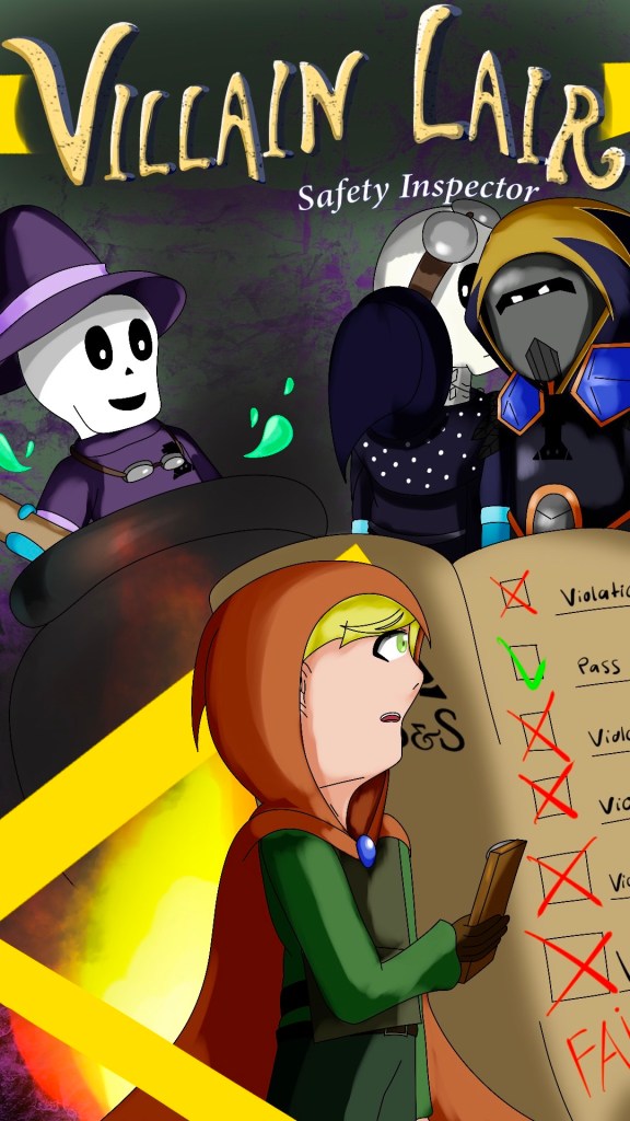
The Creation of Villain Lair Safety Inspector
01
project
overview
Miami University’s Games + Simulation program provides its students with a unique 3 semester long capstone sequence that gives time for the full development of a video game. At the start of the first semester, each student pitches a game with the top five game concepts go on to be produced for the remaining 2.5 semesters. Joining a small team of only 4 people, I took up the role of UX Supervisor (alongside creating art assets) to ensure that a game know as Villain Lair Safety Inspector (VLSI) was, well, fun to play. User experience is pretty much all a video game is, so nearly every facet of this project from the visual assets to the player’s movement to the dialogue contributed to the UX.
Programs Used:

02
project
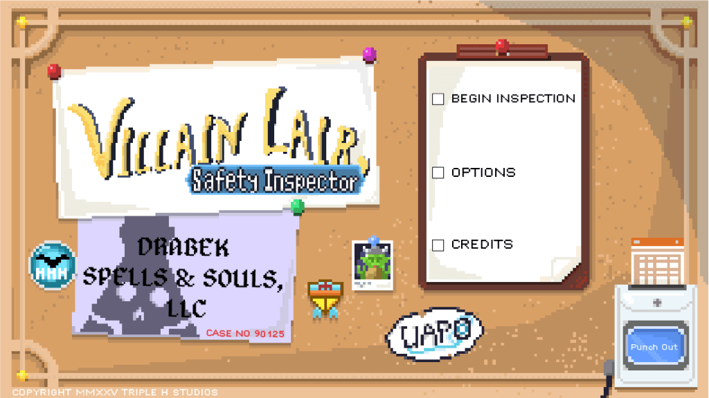
beginnings
The concept was simple. Playing as a member of the Underling Awareness and Protection Organization, (UAPO) it is the player’s job to ensure that evil villain’s lairs are safe enough for said evil villain’s minions to work in. The game was intended to be mostly text based, where players listen to minion’s testimonies and find violations within the lair. The most important UX roles at this point were to make sure that the game was intuitive to control and that the objective was clear. The tricky part to this was as a video game, the correct answer should not be told directly to the player. We had to walk a line between making details obvious while still allowing the player to feel as if they had made the discovery on their own.
03
unplanned
challenge
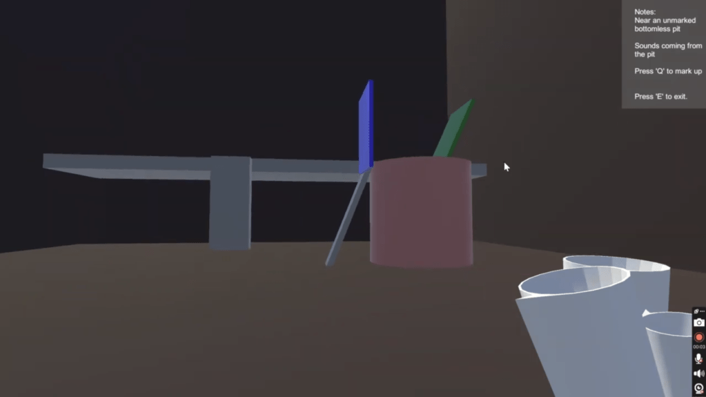
This first version of the game existed within a 3D space where the mouse could be used to look around a static scene and click on points of interest. Later versions would go on to add movement, allowing the player to look and move around the room at their own leisure. 3D development, however, is challenging and time consuming, to say the least. At the end of the first semester of development, we realized that we were far in over our heads. Many of our intended UX features were yet to be implemented due to the fact that we had only just managed to get everything working at all. There were no clever puzzles, no discovery for the players to make. Just moving around a simple box-shaped room and clicking on the obvious characters to read mostly useless dialogue.
While we were praised for creative writing, strong character designs, and an overall fun feel for the game, the 3D demo was not working out. Cumbersome controls, unlabeled buttons and a less than intuitive “tutorial” left many of our playtesters lost and confused. Something needed to be done.
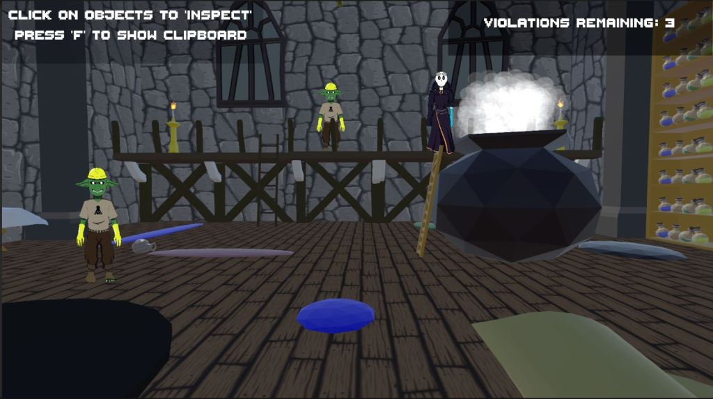
Footage from the final 3D game.
04
a fresh
start
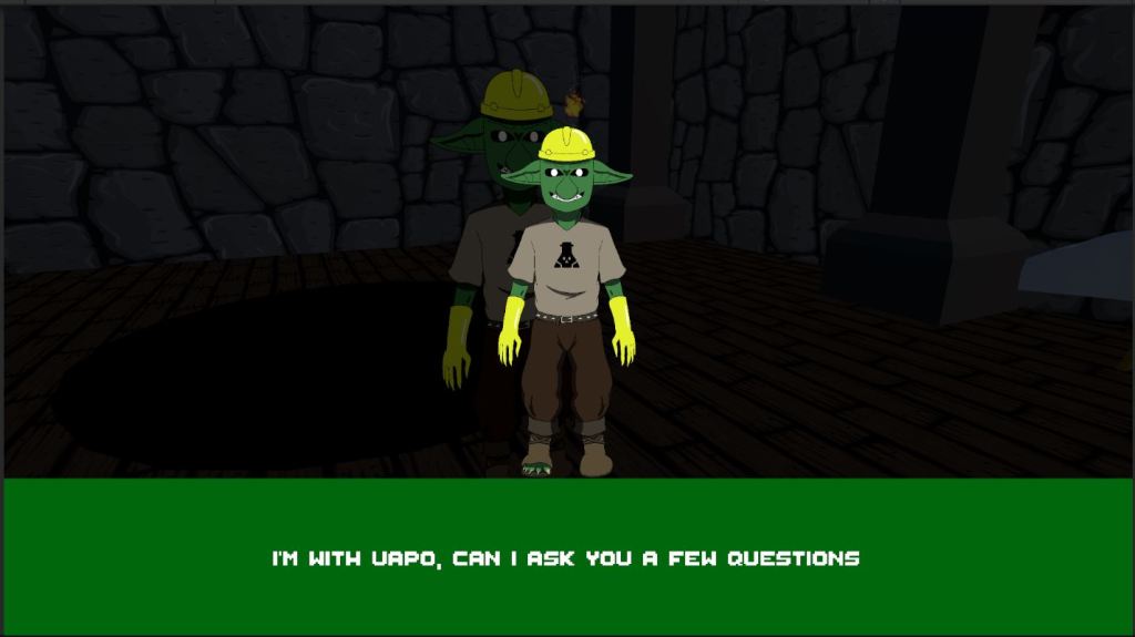
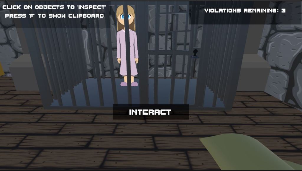
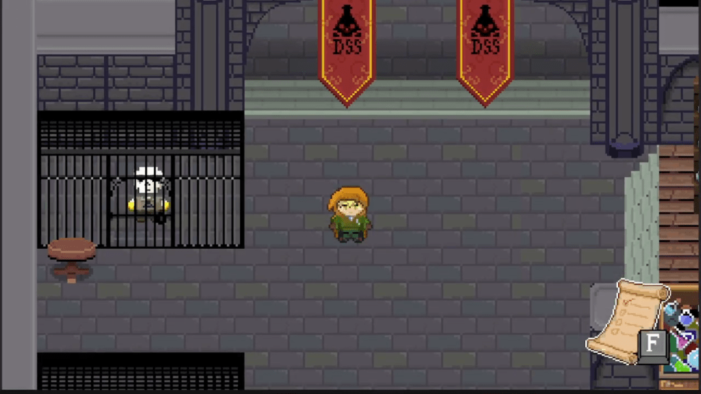
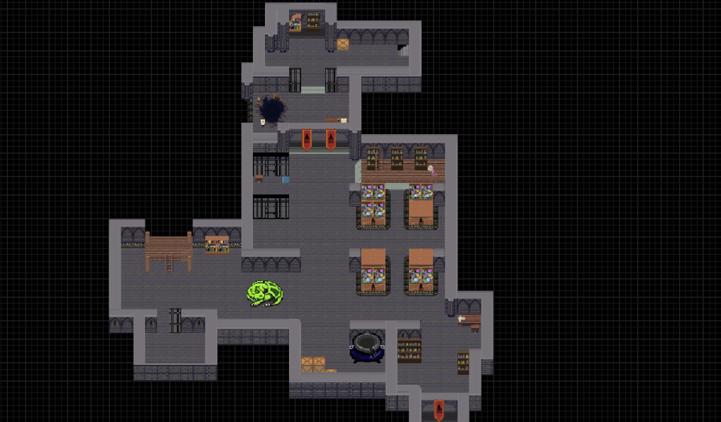
Beginning at the start of our second semester of development, we made the difficult decision to effectively restart development entirely, left with nothing except some character designs and the overall concept of the game. This of course meant that we had to redo much of our process including getting the game to work again before we even had the chance to flatten out the UX kinks. The restart did work out incredibly well. The new game was two dimensional and viewed from a top-down perspective, similar to old The Legend of Zelda games and made use of pixel art which was far easier to make look professional than 3D models. We got back to our previous point in only about a month and half and began to work on adding the polish needed to make the game enjoyable.
The new version of the game is less hand-holdy and lets players discover things on their own.
05
adding
polish
Getting to where we are now
The first issue I began to tackle was clarity. Much of the feedback we received was addressed towards confusing controls and lack of clarity on how certain actions were to be done. We were able to address this through multiple avenues such as repeated dialogue from characters reminding players on what actions to take, on-screen button prompts for opening menus and controlling the character, and visual and audial feedback.
Other improvements made to the UI included details to make it more clear on who was talking during conversations, decreasing the amount of text that can be displayed on screen at once to improve visibility, and adding backgrounds to dialogue scenes to add immersion.
In its current state, Villain Lair Safety Inspector is leaps and bounds above the version it was after that first semester of development. Throughout the development of the game I learned important skills in UI and UX and how to guide a player (user) through an experience. The skills I’ve learned over this three semester sequence have taught me how design principles such as repetition, emphasis, and contrast tie directly into user experience design and how UX as a whole extends to nearly every part of daily life.